Interior photography is the most challenging of all the professional genres of commercial photography. Every detail is critical. Every prop must be correct and in just the right location. Busy-ness must be avoided. Things must be cleaned up and simplified. Lighting can be challenging. And in addition to all that, one must understand how best to portray the look and feel of the space that the architect or interior designer worked so hard to convey.
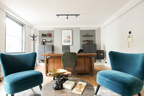
Photo by Gian Paolo Aliatis
The photograph will always be better than the reality. It will have clarity of vision, illustrate what your client is selling, have an atmosphere of light (usually created by the photographer’s lighting), be inviting, have a feeling of presence, have a clean and simple look, and it will have drama and movement.
These are some simple rules to start with.
1. Define your client
Who is your client? The architect, builder, or realtor will want to show relationships of the design to the space and the intention and flow of the design layout. The interior designer will be concerned more with the furnishings and the details of their design. Architects like drama and usually don’t mind some wide-angle distortion, whereas the interior designer may find distortion to be a problem. In any case, the distortion must be used judiciously–it has to contribute to the overall composition in an effective way.
2. Angle
The one-point perspective or “head on” view is strong and symmetrical. The two-point perspective may define the space effectively, but pay close attention the how the space of the photograph is divided. The emphasis should be on two thirds of the composition; don’t divide the space in half.
For architects and builders, be sure to show significant design detail and take into consideration how the spaces work together. Don’t try to show too much–keep the viewer’s attention on important elements. A couple of good photographs are far more effective than a lot of weak ones. Go for quality, not quantity. Remember the adage: less is more. Wide angle doesn’t mean that one should show more, just because it is possible to do so. Everything in the photograph must hold its own weight and be accountable to the overall composition. Every angle, line, and detail has to work in the photograph.

“Interiors” captured by Tom Merton
3. Height
A low angle foreshortens and can be very nice for some views. However, it is important to show the important elements of the interior, too. Be high enough to separate the elements and keep the composition clean and clear. Avoid a cluttered look and having things “grow out” from the tops of furniture, etc. Occasionally, a high view is required, but I usually find that a little lower than eye level is favorable and pleasant. The higher the lens, the more foreground distortion. A piece of furniture too close to the foreground (especially a round table) will become very distorted with a higher view. Often the foreground will determine the camera height. Having the foreground “fall” out toward the bottom edge of the photograph is very disturbing and must be avoided by either adjusting the camera height or camera position or by moving the furniture back from the foreground.
4. Arrangement
After the angle has been determined, frequently the furniture must be rearranged to fit the format and perimeter of the photograph. Sometimes this may be subtle; other times it may be drastic. A pleasing composition and balance must be found, and concerns such as distortion of furniture, tangents, and “busyness” are addressed at this time. I always get the large pieces in place first and then work down to the smaller scale furniture from there. Everything must be perfect–from the direction and relationships of the furniture to each other as well as their relationship to the room. Always adjust everything “to camera.” The room setting may appear totally out of place from another vantage point, but it will look correct from the camera position and that is all that matters.

“Architecture Photography” captured by Annechira Shivakumar
5. Props
The final details in the set are the arrangement of the props. I start by taking out all the clutter and then carefully putting things back or finding other elements that complement the space. Bookshelves are rearranged to look more uniform and uncluttered, desks and work areas are totally cleaned up. I almost always add fresh flowers and plants to soften the look and feel of the space, as well as books to fill space on tabletops, etc. I like to have height to contain the edges of the image. Taller plants can work well for that.
Kitchens are particularly challenging to prop; they must look clean and orderly but also livable. I frequently use bread, bowls of fruit, flowers, etc. Simple breakfast settings of orange juice, coffee, bagels, and a newspaper can also work well.
Pay particular attention to chair legs–they can get very busy-looking if not handled carefully. In corporate settings, conference room chairs should have the legs and wheels all going in the same direction, the chairs should all be spaced exactly the same–again–it may not appear that way from another position, but it must look very uniform from the camera position. A clean, styled uniform look that is also loose enough to feel real is the key to successful propping.
One of the most important qualities that the interior photographer must have is patience, as well as being extremely detail oriented. It is essential to have everything perfect: the direction of the cup handles, the arrangement of the flowers in the vase, the space between accessories on the table. Lampshades must be straight and undistorted. The color of the page in the open book must work with the photo. Every element in the interior photograph must play off of and work with each other, as well as within the context of the whole.

“Interiors” captured by Tom Merton
6. Lighting
Good lighting separates the average photographers from the great ones. Light defines the feel of the space and it gives it a three-dimensional look. The trend lately, especially since the advent of digital photography, has been to predominantly use ambient light. For some clients, and under specific conditions, this may be acceptable. However, compared to what good lighting can do for the scene, the results are very flat, uninspiring, and “dead.”
My approach to lighting varies depending on the space and client, but my philosophy is consistent. I light to create a beautiful photograph; my lighting always enhances the space, and I use my lighting to lead the viewer’s eye through the space and feature important details and design elements. A good photograph will always look better than reality. Sometimes my lighting will simply enhance the existing light, other times I will totally transform the interior or the exterior of the building. Whether the lighting setup is complex or simple, good lighting will always enhance the overall look of the photograph. It will add highlights and shadows, separate tonality (especially with dark with tones and shadows), and emphasize texture. It will bring saturation to color and a feeling of life to what would otherwise be a lackluster image.
Regardless of how beautiful the space is and how well the designed lighting adds atmosphere, adding lights will always help the scene. The only exception to this rule would be in very large spaces, and even then, placing lights in strategic spots can make a big difference.

“Interiors” captured by Tom Merton
As with anything else in life, in order for one to excel in a particular field, one must be passionate about it. Photographing interiors is a highly specialized field, and it is not for the faint of heart. An interior photographer must be very detail oriented and have a love for–and at least a layman understanding of–architecture and interior design. Often times, the client will totally depend on your expertise, so your knowledge of what works in the interior photograph must be at least on a level as the professional whom you are working for. Personally, I find the blend of technical details with aesthetics to be very pleasing. Every shoot is like solving a puzzle–the work never gets boring.
About the Author:
Paul Schlismann is a professional architectural photographer who has specialized in photographing architecture and interiors since 1980 for the professional architect, interior design, hospitality, architectural product and corporate markets (www.schlismann.com). Having been established in his career for over 30 years as a Chicago architectural photographer, he now also has an office located in Arizona, as well, and is working in Chicago, Phoenix, Las Vegas, Los Angeles, San Diego, and California statewide.
Like This Article?
Don't Miss The Next One!
Join over 100,000 photographers of all experience levels who receive our free photography tips and articles to stay current:


I’ve learned a lot as an interior photographer from this article, Thanks Paul it really helped me.
Great share and thanks for the mention here. How cool is that.
Good skils for make amazing interiors photo!
I’m amazed by what you said that even the height of the elements in a photo is being considered to have a good photo. I’m planning to sell my house and place it on the market. I’d like to make sure that it will look good on the photo so it can gain attention. I will make sure to consider hiring an interior photographer.